The Importance of Mobile Optimization in Digital Marketing
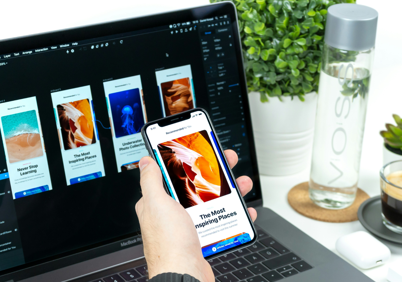
Imagine searching for a product on your phone, finding a promising website, and then waiting several seconds for the page to load. When it finally appears, the text is tiny, buttons are difficult to tap, and you have to zoom in just to understand the information.
What would you do?
Most people would simply leave and look elsewhere.
This simple example explains why mobile optimization in digital marketing has become so important. Smartphones are now a major part of how people search for information, compare products, read reviews, watch videos, communicate with businesses, and shop online. If your website does not provide a smooth mobile experience, even an effective digital marketing campaign can struggle to deliver results.
What Is Mobile Optimization?
Mobile optimization means designing and improving a website so that it works smoothly across smartphones, tablets, and other mobile devices. A mobile-optimized website should adapt to different screen sizes while keeping its content easy to read and its features simple to use.
However, mobile-friendly website optimization is about more than making a website fit on a smaller screen. It also involves page speed, navigation, font sizes, images, buttons, forms, and overall usability.
The goal is straightforward: visitors should be able to find the information they need and take action without frustration.
Why Mobile Optimization Matters in Digital Marketing
1. People Are Spending More Time on Mobile Devices
Think about your own internet habits. When you want to quickly search for something, check a business, read an article, or compare products, there is a good chance you reach for your smartphone.
For businesses, this creates an important opportunity. Marketing campaigns can attract people through search engines, social media, email, and online advertising, but those visitors often arrive on a mobile device.
If your website performs poorly on mobile, you could lose potential customers before they even explore what you offer.
2. It Creates a Better User Experience
Digital marketing can bring visitors to your website, but the website experience influences what they do next.
Suppose you invest in search engine optimization and your website begins receiving more organic traffic. Or perhaps you run a social media campaign that sends hundreds of people to a landing page. If that page is difficult to navigate on a smartphone, much of that traffic may leave without taking action.
A responsive website makes it easier for visitors to read content, browse services, explore products, complete forms, and contact your business.
Simple improvements can make a major difference. Clear menus, readable text, appropriately sized buttons, and straightforward navigation help remove unnecessary obstacles from the customer journey.
3. Mobile Optimization Can Support Higher Conversions
Getting visitors to your website is only one part of digital marketing. The next step is encouraging them to take meaningful action.
For an online store, that action might be purchasing a product. For a service business, it could be requesting a quote, making an appointment, or submitting an inquiry.
A complicated mobile experience can make these actions difficult. For example, a long form with tiny fields can be frustrating to complete on a smartphone.
Good mobile website optimization makes the journey from discovering a business to taking action more convenient.
4. It Supports SEO and Search Visibility
Mobile optimization and SEO work closely together. Search engines consider the experience that websites provide to users, including factors related to mobile usability and page performance.
This means businesses should not think of mobile optimization as completely separate from their SEO strategy. A website needs useful content, strong technical foundations, good usability, and fast performance to provide a positive experience.
If your digital marketing strategy depends heavily on organic search traffic, making your website easy to use on mobile devices should be an important part of your overall SEO efforts.
5. It Builds a Stronger Brand Impression
Your website may be one of the first places where a potential customer interacts with your business.
A professional mobile experience can make your brand feel more trustworthy and user-focused. In contrast, a website that looks outdated, loads slowly, or requires constant zooming can create a negative impression.
Visitors may never consciously think, “This website isn’t optimized for mobile.” Instead, they simply experience the frustration and move on.
That is why mobile optimization for businesses is not merely a technical task. It can also influence how people perceive your brand.
How to Improve Your Mobile Website
The good news is that improving your mobile experience does not always mean rebuilding your entire website.
Start by testing your website on different smartphones and screen sizes. Check whether pages load quickly and whether important information is easy to find.
Make navigation simple and ensure links and buttons are large enough to tap comfortably. Compress large images and remove unnecessary elements that can slow down your pages.
Pay particular attention to forms. If visitors need to complete an inquiry or registration form, keep it as simple as possible. Nobody wants to spend several minutes fighting with a complicated form on a phone.
It is also useful to test your most important customer journeys yourself. Try finding a product, requesting a quote, contacting your business, or completing a purchase entirely from a smartphone.
You may discover small problems that are difficult to notice when viewing the same website on a desktop.
Practical Mobile Audit Checklist
Not sure whether your website provides a good mobile experience? Use this quick checklist to identify common problems:
- Check page loading speed: Do your important pages load quickly on a mobile connection?
- Test different screen sizes: Make sure your website displays properly on different smartphones and tablets.
- Review font sizes: Can visitors read your content without zooming in?
- Test navigation: Can users find important pages with only a few taps?
- Check buttons and links: Are they large enough and spaced far enough apart to tap comfortably?
- Test contact forms: Can visitors complete forms easily using a smartphone keyboard?
- Check images: Are images properly sized and compressed without sacrificing unnecessary quality?
- Look for intrusive pop-ups: Make sure pop-ups do not cover important content or make navigation difficult.
- Test your checkout process: If you sell online, complete a purchase yourself using a mobile device.
- Check phone numbers: Make sure phone numbers are easy to find and can be tapped to call.
- Review important landing pages: Test the pages used in your advertising, email, and social media campaigns.
- Test on an actual device: A website that looks fine in a desktop browser’s mobile preview may still have issues on a real smartphone.
Go through this checklist regularly, particularly after redesigning your website or adding new features. Even small changes can sometimes create unexpected mobile usability problems.
Mobile Optimization Is an Essential Part of Modern Marketing
Digital marketing is ultimately about reaching people where they are and giving them a convenient way to interact with your brand. With smartphones playing such an important role in everyday internet use, businesses cannot afford to treat mobile visitors as an afterthought.
From SEO and social media to email marketing and paid advertising, almost every digital marketing channel can bring visitors to your website. A fast, responsive, and easy-to-use mobile experience gives those visitors a better opportunity to engage with your business.
Mobile optimization is therefore more than a technical improvement. It is about respecting your audience’s time and making every interaction as simple as possible.
Ready to Improve Your Mobile Presence?
If your website has not been reviewed for mobile usability recently, now is a good time to take a closer look. Use the checklist above to identify potential problems, test your most important pages, and make improvements based on how real visitors use your website.
Start optimizing your website for mobile today and create a faster, smoother experience that helps turn digital visitors into valuable customers.
To read more interesting articles visit – https://ventureblogging.com